internship
Brainstorm works on different kinds of projects: Logos, brochures, magazines, packaging, animations, websites, illustrative projects.
It has it’s own style that varies through projects, from minimalist to more fun, friendly or illustrative.
Logos
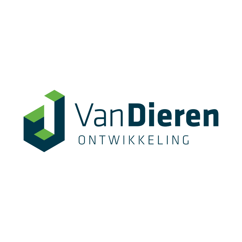
The company works with real estate and construction services. The logo is bold but friendly, looks like a house or constructions and letter D (Van Dieren is the surname of customers.)
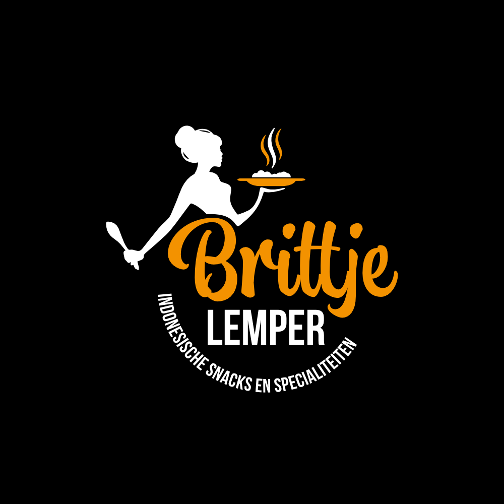
Logo for Indonesian food kiosk.
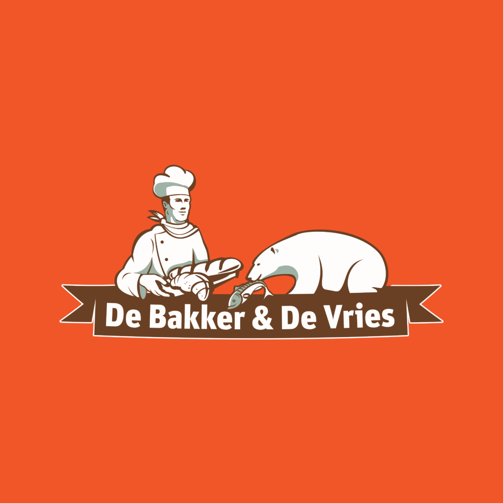
Logo for the frozen food seller
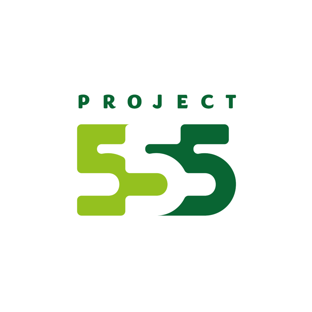
It was a challenging project because it was secretive. It was only known that it has to be:
green, fresh, organic, modern, tech.
Webdesign
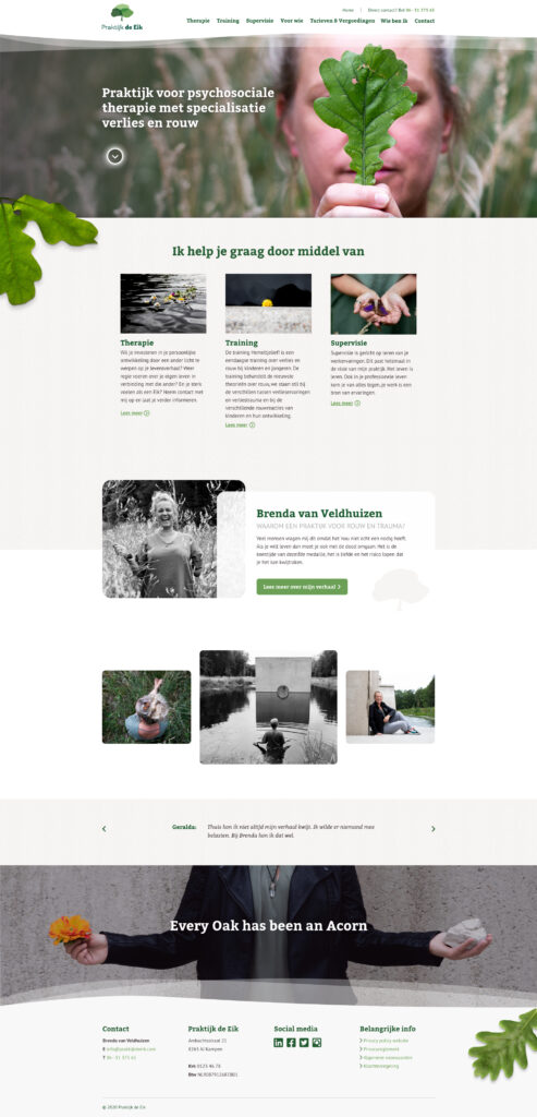
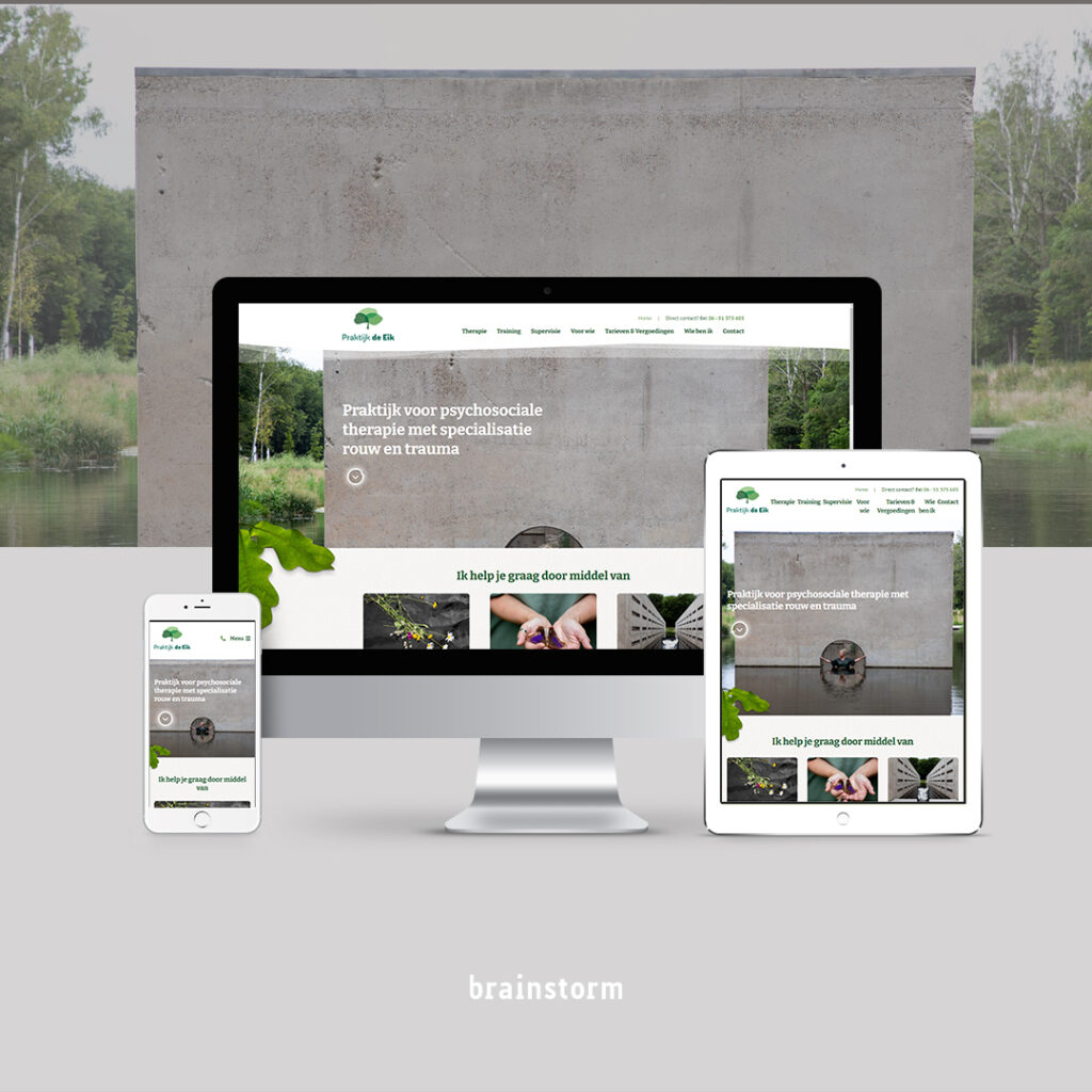
The client is a psychologist, who helps people to deal with loss. Her idea is a metaphor, to compare overcoming difficulties to a growing acorn, which becomes a strong tree Praktijk de Eik.
The webdesign was inspired by the logo (made by another colleague) – oak tree with transparent parts and for transition used transparent waves. These wavy transparent elements are reflected on the website.There are also forest elements, to make the website look more alive.
Illustrations
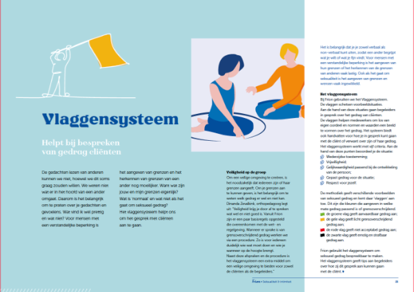
Frion magazine is about intimacy. I was responsible for the illustrations.
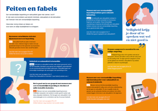
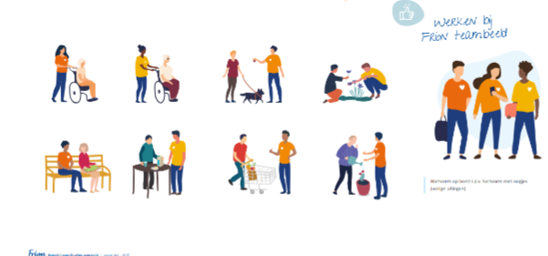
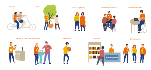
Illustrations for Frion website: The website has to attract young, fit and enthusiastic people, who would like to care of people with mental disabilities.
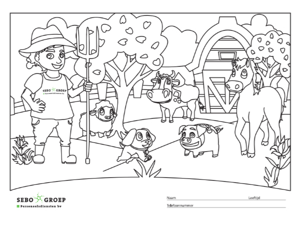
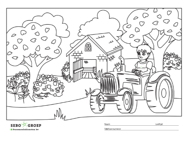
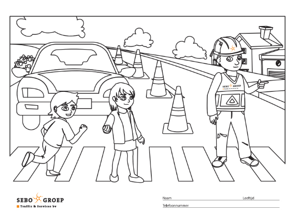
SEBO Groep: colouring pages for children.